Gough Whitlam Park

Client
Gough Whitlam Park
Services
Creative Direction
Wayfinding
Year
2025
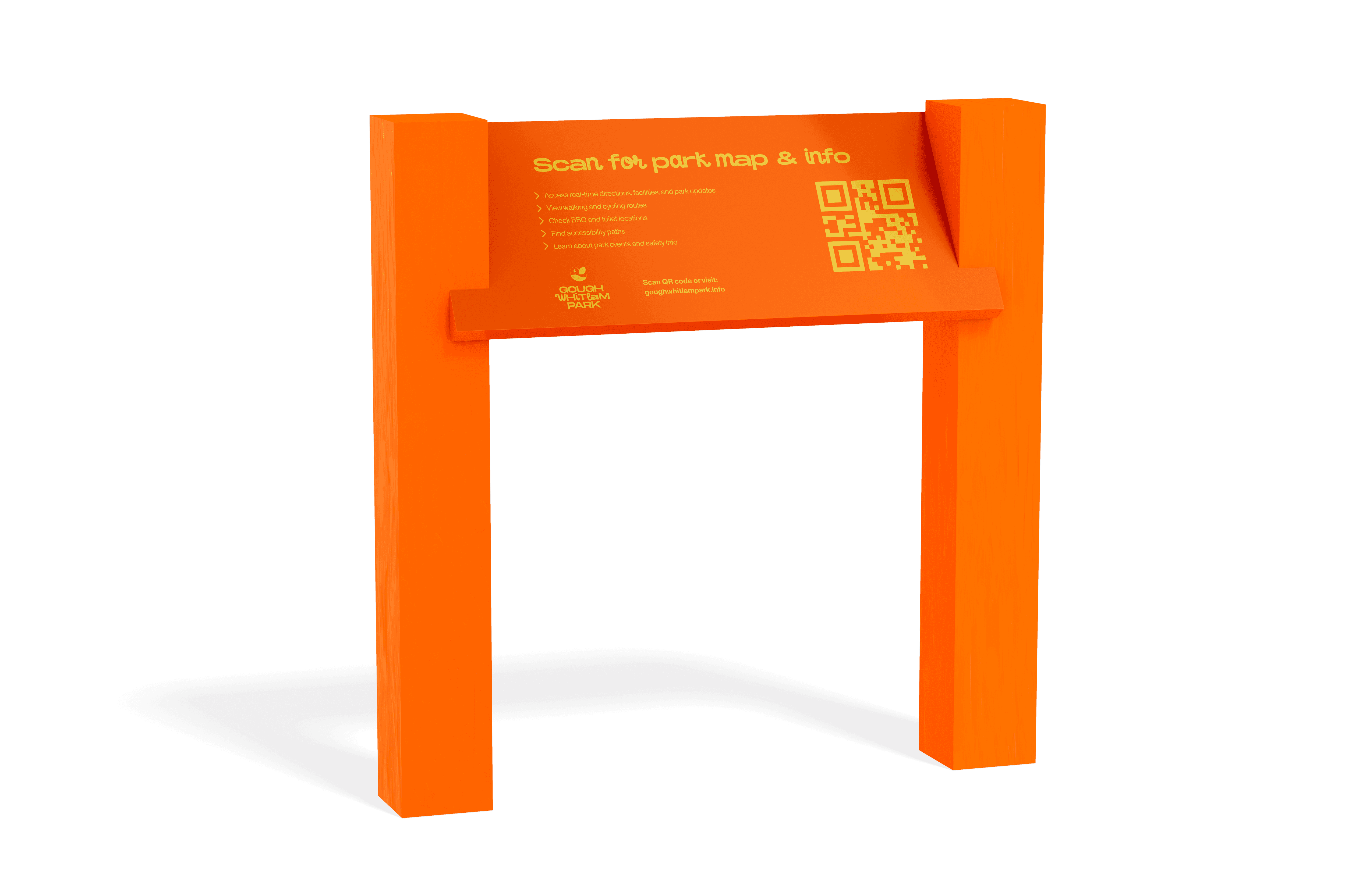
Gough Whitlam Park is a riverside public space in Earlwood, Sydney, situated alongside the Cooks River and Wolli Creek. The park combines recreational, natural and community spaces, including walking and cycling paths, sporting facilities, a playground, fitness equipment, a café and public amenities. For this project, I explored how a wayfinding system could make the park easier to navigate while creating a stronger sense of connection between its different spaces. Gough Whitlam Park had no clear signage system. Visitors couldn't orient themselves, facilities were hard to find, and what signs did exist were inconsistent and faded. The brief was to fix that. So, how might we create a clear and accessible wayfinding system that helps visitors confidently navigate Gough Whitlam Park while strengthening their connection to the surrounding environment? I developed a visual wayfinding system incorporating directional signage, maps, icons, typography and colour. Rather than designing individual signs in isolation, I created a consistent system where each touchpoint works together to support the user's journey, from initial orientation and decision-making to destination identification and confirmation. The type system runs on three fonts. Monument Extended carries headings and signage - its bold, confident shapes hold up at scale on outdoor signage and give the whole system a fun, energetic edge. Little Ribbon sits alongside it as the secondary face, its softer rounded forms balancing out Monument Extended's weight and adding a friendlier touch. Monument Grotesk handles body text and digital applications, keeping things legible for longer copy while staying visually consistent with the rest of the system. Colour works as a wayfinding tool, not just decoration - each zone in the park gets its own hue so visitors can read the space at a glance: bright orange for the Play Zone, sky blue for Relax and the Cycle Path, park green for Nature, pink for Sports, yellow for BBQ/Picnic, purple for Facilities, deep teal for Pet Facilities. The palette overall leans vibrant and playful, aimed at making the park feel welcoming and easy to navigate rather than institutional. The final outcome demonstrates how graphic design can extend beyond the page and screen to shape real-world experiences. The project strengthened my understanding of information hierarchy, accessibility and environmental communication, while showing how a well-designed wayfinding system can make navigating a complex public space feel more intuitive and confident.